The complimentary articles, Observant's Approach to the Display of Soil Moisture Data, Using Crop Manager, and Overview of the Crop Manager and Analyze Applications (which features some key definitions) are also available on the Help Desk. See the Software Videos section as well. This article will discuss the following:
- Feature Overview
- Login to Observant Global
- Snapshot View
- Management Data View
- Raw Data View
- Root Zone Change View
- Daily ET Calculation
- Graphing Other Sites in the Portfolio
- Links
Feature Overview
Crop Manager is a powerful set of graphical, data representation-and-analysis tools that give an overall snapshot of soil water conditions throughout your farming operation. It can provide detailed analysis of conditions in each of your fields, allowing you to plan irrigation events for optimal crop-growing conditions. The Crop Manager application includes the following significant features:
- a map based, entire-farm overview with easy-to-interpret, color-coded moisture-graphics for each soil probe;
- detailed, graphic displays for in-depth data interpretation of soil conditions at each sensor;
- charts displaying weighted averages (or sums) of moisture throughout each location's root zone;
- graphs of soil data for each separate sensor level (either on the same chart or separately) and
- management-line tools for more efficient irrigation choices.
Login to Observant Global
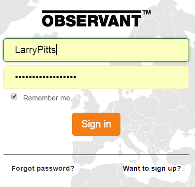
Go to app.observant.net and enter your User Name or email address and Observant Global™ password.
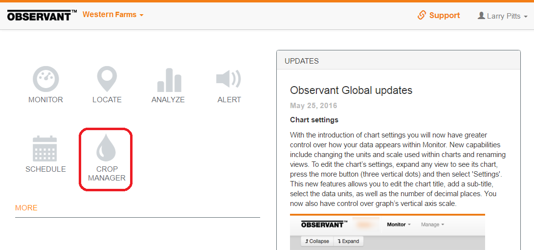
When Observant Global opens, click on the Crop Manager icon.
Snapshot View
The default landing page of Observant Global's Crop Manager is a summary page referred to as Snapshot View.
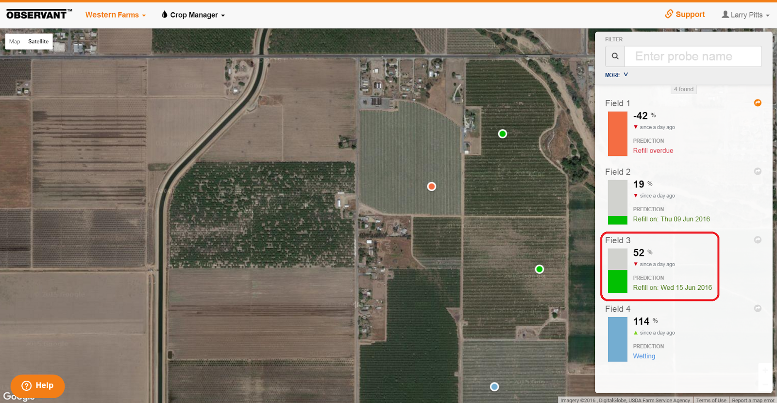
Because each Observant telemetry field unit has GPS built-in, the map provides an accurate representation of each site's exact location. It is possible to click on the map and drag it to move to the desired view. You can zoom in and out by either using the mouse wheel or holding down the ‘Ctrl’ key and using the ‘+’ and ‘–’ keys.
Management Status
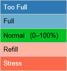
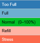
Each location marker is color coded to quickly identify the Management Status of the soil moisture at that site. The colors of the dots are those of their accompanying bar charts. The five colors represent different moisture levels of the root zone as shown below.
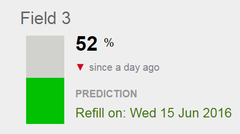
The percentage value displayed with the bar charts represents, for each probe, the most recent logged value of a weighted Root Zone Summary of the moisture level available to the plant expressed as a percentage of the moisture range between the ‘Full’ and ‘Refill’ Management Lines. For a glossary of these and other terms, see Overview of the Crop Manager and Analyze Applications. For a detailed discussion of how this impacts an irrigation schedule, refer to Monitoring Soil Moisture for Optimal Crop Growth.
It is important to remember that Field 3’s value of 52% does not signify percentage of water content in the root zone, but instead reflects a relative moisture level. Ideally the green band has been adjusted so that it reflects a region of moisture levels where water is readily available to the plant. So, when at 100%, the plant has the maximum amount of water that it can use (and the site is at Field Capacity). At that point more moisture is no longer beneficial. Below 0%, the crop has experienced the Management Allowable Depletion and it is time to begin irrigation.
In addition to this Management Status %, two other items provide quick notice of recent changes in moisture at the site.
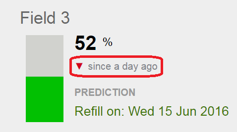
The red ▼indicates that in the past 24 hours the soil moisture at this site has decreased.
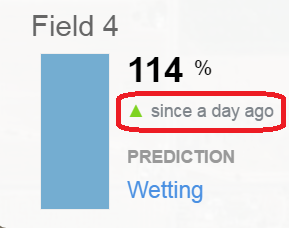
The green ▲ indicates that in the past 24 hours soil moisture at this site has increased. The root zone moisture level has wetted and no refill is currently required.
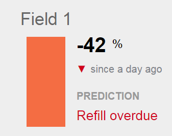
Field 1 has fallen considerably below the refill line and is clearly overdue for irrigation.
Predicted Refill Date
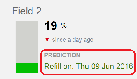
The refill date is an estimated date for a refill based on the depletion rate in the past 24, 48, or 72 hours. The depletion rate is determined by applying linear regression analysis to the Root Zone Summary values within the selected timeframe. The refill date indicates when the Root Zone Summary value will reach the lower level of the 'normal' green-colored band. The rate will vary depending on weather conditions and other factors.
Filters 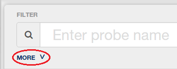
At the top of the right-hand column, click on MORE to access the various filters.
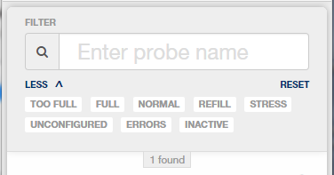
You can use system-defined filters to quickly find monitored locations whose root zone summary falls in a region with a particular color status
or sites with the following additional statuses:
- UNCONFIGURED (undefined management levels)
- ERRORS (soil moisture probes with detected issues — eg, cabling problems or sensor failures)
- INACTIVE (decommissioned soil moisture probes from locations retaining historical data)
A detailed, graphical depiction of look at the prior moisture levels in the root zone is also easily shown.
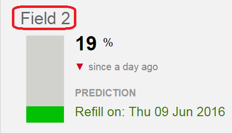
By clicking on a site name, a graphical display of that site’s Root Zone Summary will be displayed in its Management Data View.
Management Data View
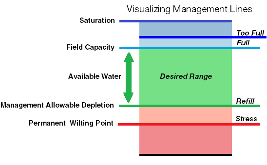
In this new Management Data View, the site's moisture data is presented on a chart that has been divided into five moisture zones, determined by four Management Lines, which are site specific and initially based on previously recorded site data. Like the bar charts in the snapshot view, the graph is divided into five different colored bands that correspond to different ranges of soil moisture in the root zone.
Here is the actual graph of a Root Zone Average of Field 2 plotted for a period of 6 months.
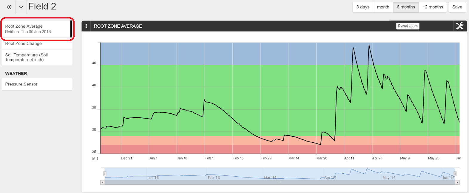
Note that, in this graph, the upper display limit has been set below the ‘Too Full’ Management Line.
Configuring Management Levels
Clicking on the tool icon in the upper-right corner of the graph will reveal a drop-down menu.
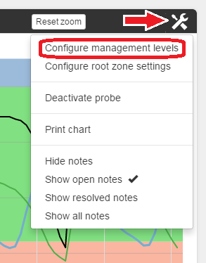
Clicking on ‘Configure management levels' allows the chart’s four Management Lines to be readjusted as the growing season progresses.
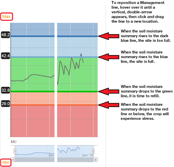
The upper and lower limits of the displayed chart are easily adjusted by simply clicking on ‘Max’ or ‘Min’ on the left side of the chart and entering new values. Note that on this chart the current levels of the four Management Lines are shown in arbitrary Moisture Units (MU). For further discussion of the use of Moisture Units, see the Help Desk article, Observant's Approach to the Display of Soil Moisture Data.
Where these Management Lines are placed will depend on previous data collected, its interpretation and your management goals. For a detailed discussion of setting Management Lines, refer to the Management Lines portion of the Using Soil Moisture to Make Irrigation Decisions section of Monitoring Soil Moisture for Optimal Crop Growth.
Configuring Root Zone Settings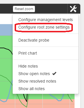
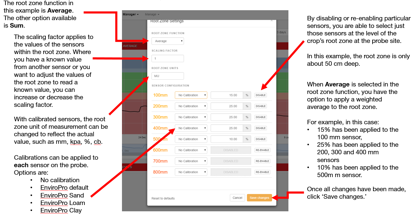
The ‘Configure root zone settings’ screen allows you to:
- Select the root zone for the site.
- Select either average or sum for the Root Zone Summary.
- Apply relevant calibrations to each sensor.
- Apply a scaling factor to the probe data.
- Edit the description of the unit values for the sensor data.
Pan and Zoom Features
The initial range of a chart can be established as any one of six different time spans — from the latest three days up to the most recent year.

Here, once again, an interval of six months has been chosen. By default, the Root Zone Summary is displayed (in this case, a weighted average of the chosen sensors within the site’s soil probe).
It is also possible to view just a portion of the chart in greater detail by clicking and dragging a rectangular box around the region of interest. Here, we’ve chosen to examine the first few weeks in April. A dotted blue line represents the path the cursor took while defining the region:
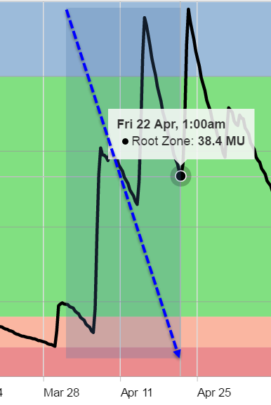
Note that, as the cursor moves across the chart’s timeline, the data recorded at that moment is displayed. This is a feature of all Observant Global graphs. When the mouse button is released, the chart zooms in to display just the region chosen.
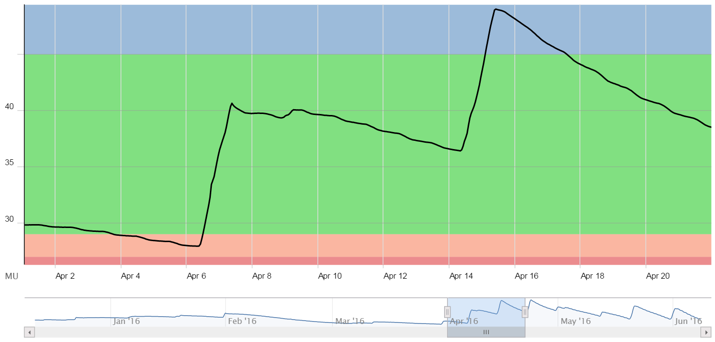
The full, six-month time span is still displayed in the small graph just below the main chart. The region highlighted there in light blue represents the same time span that is displayed in main chart.
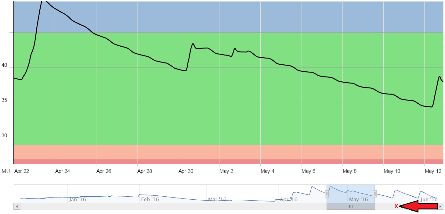
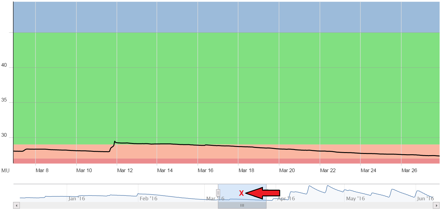
The highlighted time span (in this case just a few weeks in length) can then repositioned in a variety of ways to examine different portions of the six month period.
- If we click a button at either end of the gray bar (on the bottom of the small, six-month chart), it will step that time frame in that direction. Here, clicking on the left-hand button has shifted the chart’s time span 4 days back in time.
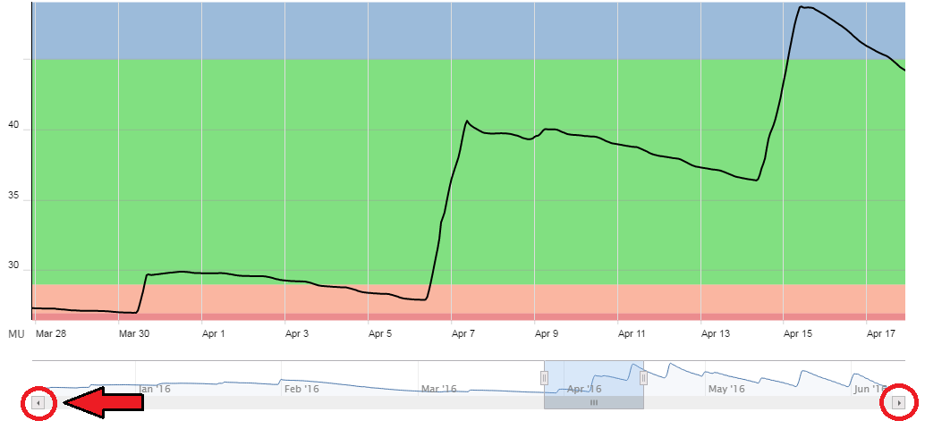
- If we click inside the highlighted region we can then drag that time span to any position along the bottom graph.
- If we click inside the gray bar, it will shift the view to an adjacent span (of the same length) in that direction. Here we’ve clicked on a spot (x) to reposition the view one span to the right:
- If, however, we click on a location above that gray bar, then that same span will jump to wherever we’ve clicked (centered on that spot):
- Both left and right edges of the highlighted region can also be dragged independently to define a new span. Here, we have moved the right edge towards the right:
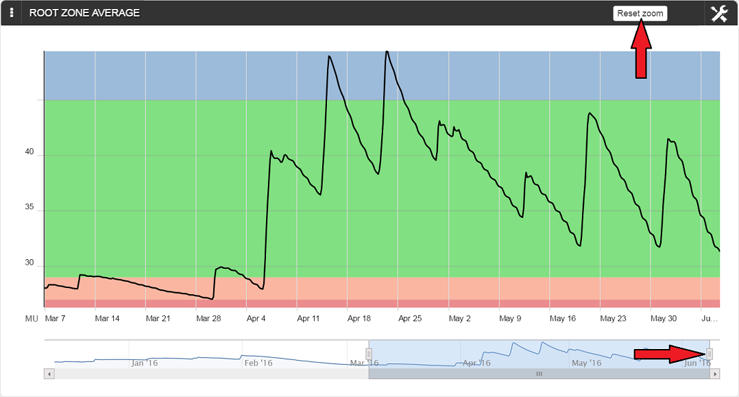
Be aware that when clicking and dragging anywhere on the main Root Zone chart, the region selected (even if it is a very small area) will be displayed. A tiny area inadvertently selected, for example, may suddenly display a chart with no recognizable features! Fortunately, you can easily return to the initial chart by simply clicking on ‘Reset zoom’ in the upper right corner of the chart.
Adding Comments
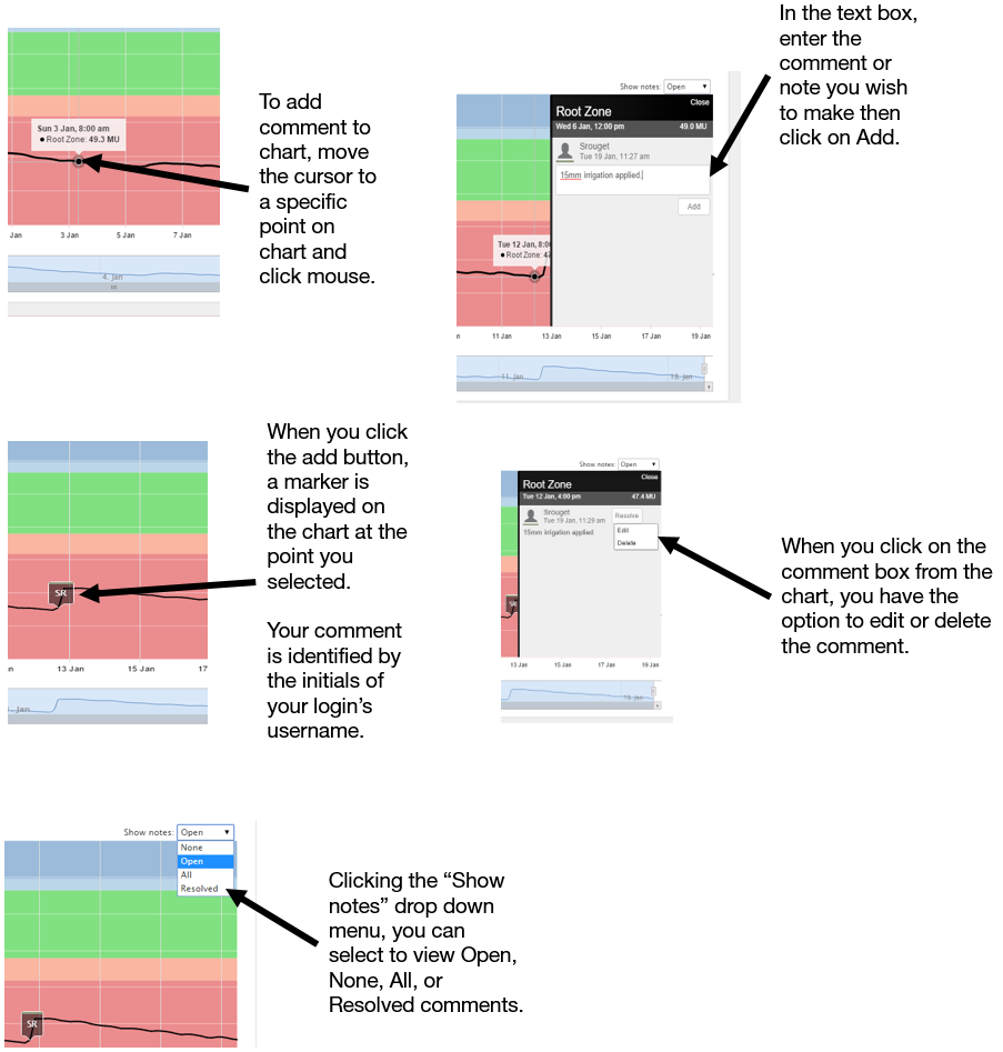
By clicking on the center of any point displayed under the callout, text comments are easily added to the Root Zone Chart. This allows you to document any physical events affecting the data being logged. Comments such as 'Irrigation Started' or 'Beginning of Rainfall Event' will help explain why moisture levels changed. These notes are stored with the permanent log for your system and can be viewed by all users with access to your system.
Raw Data View
Display Separate View — Soil Moisture
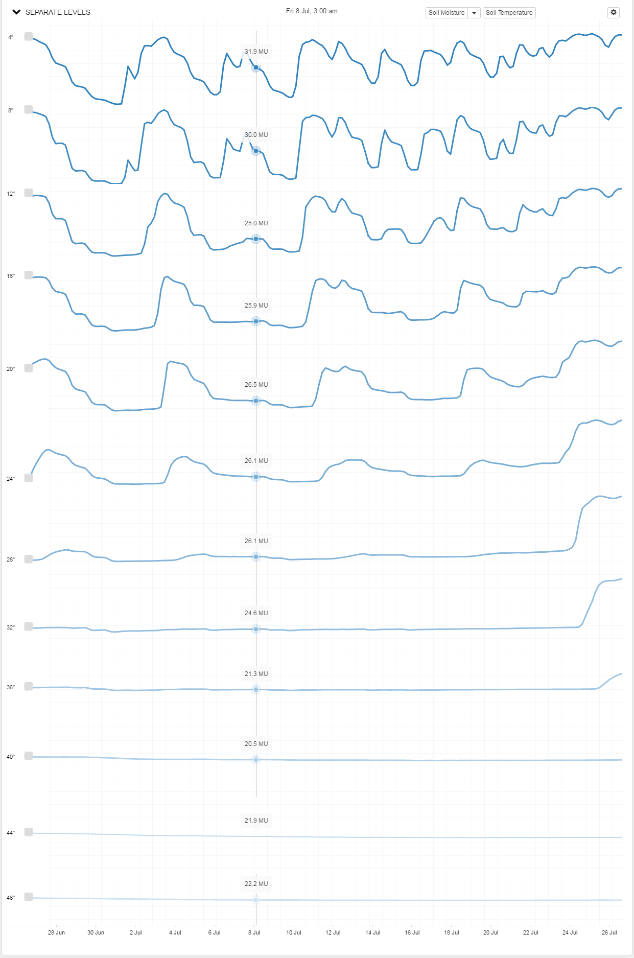
In addition to displaying and analyzing the Root Zone Summary graph, you can display data from each sensor depth separately. This is useful for observing soil moisture characteristics at individual positions within (or below) the root zone.
To view sensor data separately, note that there is a 'SEPARATE LEVELS' button below the Root Zone Summary Graph.
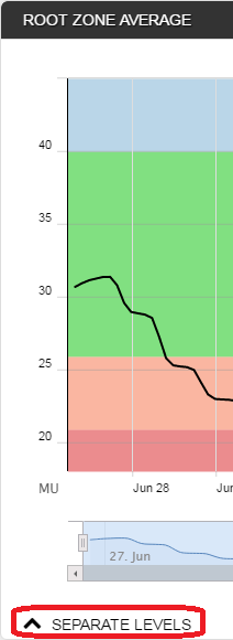
Click on the '^' on the left side to drop down the new chart. Here, for example, the raw data is displayed for each of the twelve sensors of a four-foot probe:
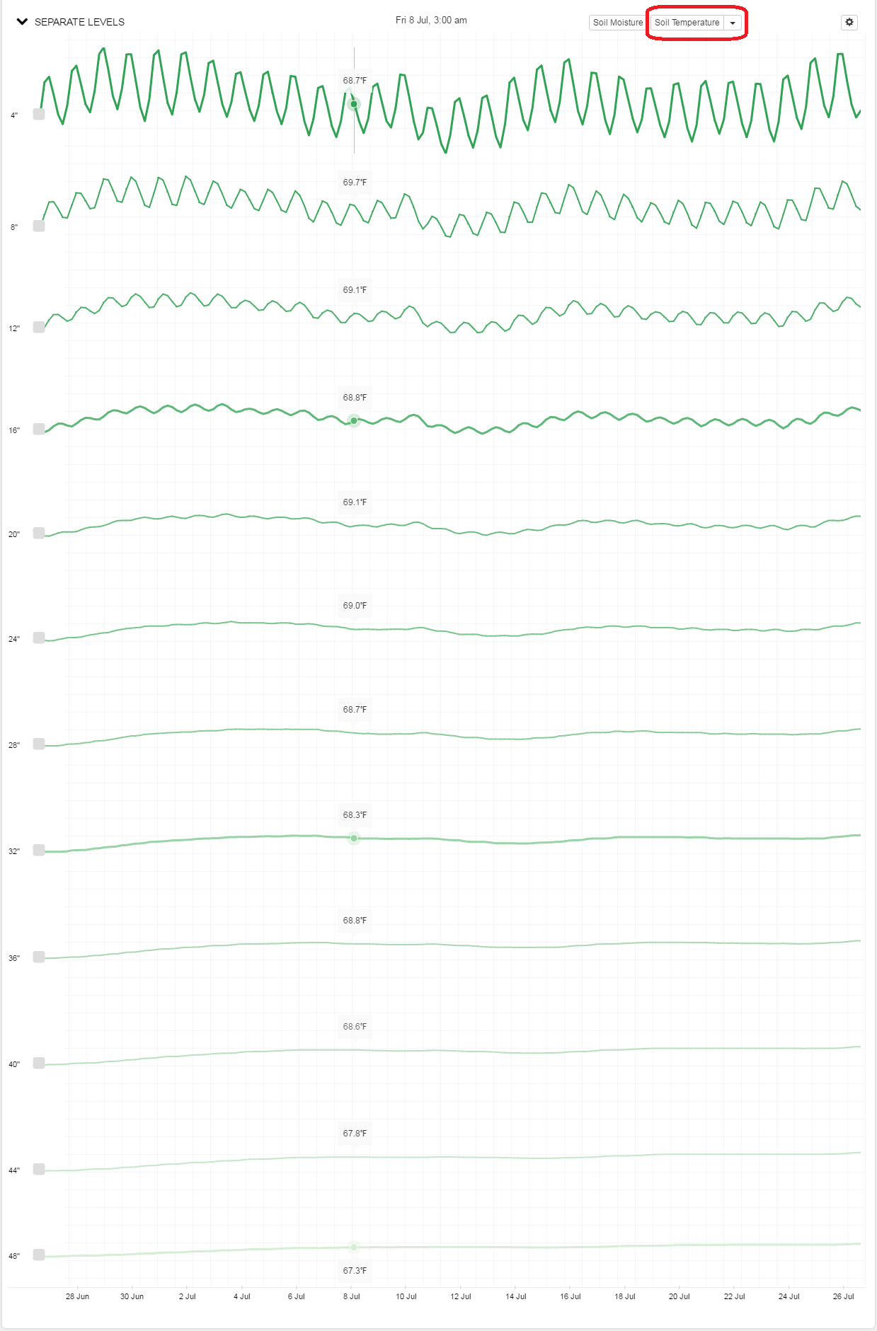
Temperature Dilsplay
In a similar fashion, it is possible to display temperature data for each sensor by choosing the soil temperature option.
Editing Root Zone and Soil Temperature Displays
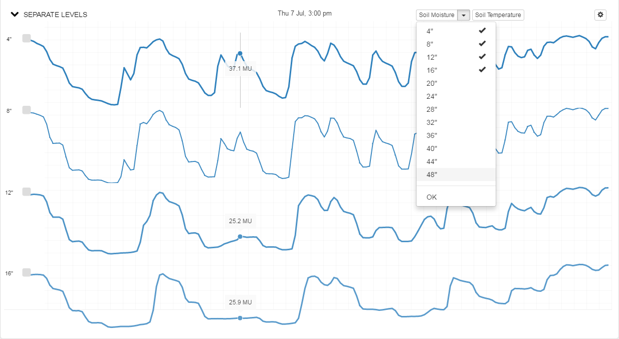
When dealing with a shallow root zone, for example, we may only wish to display a portion of a probe’s full range. This is easily accomplished for either temperature or moisture by dropping down their associated menu and deselecting any sensors whose data you don’t wish displayed. Here, we’ve only chosen to display the first 16” of a crop’s root zone.
Display Together View
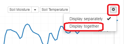
At times, it may be more helpful to display the data from different levels on a single chart. This can be done by simply clicking on the cog icon in the upper right corner and choosing ‘Display together’ instead of ‘Display separately.’
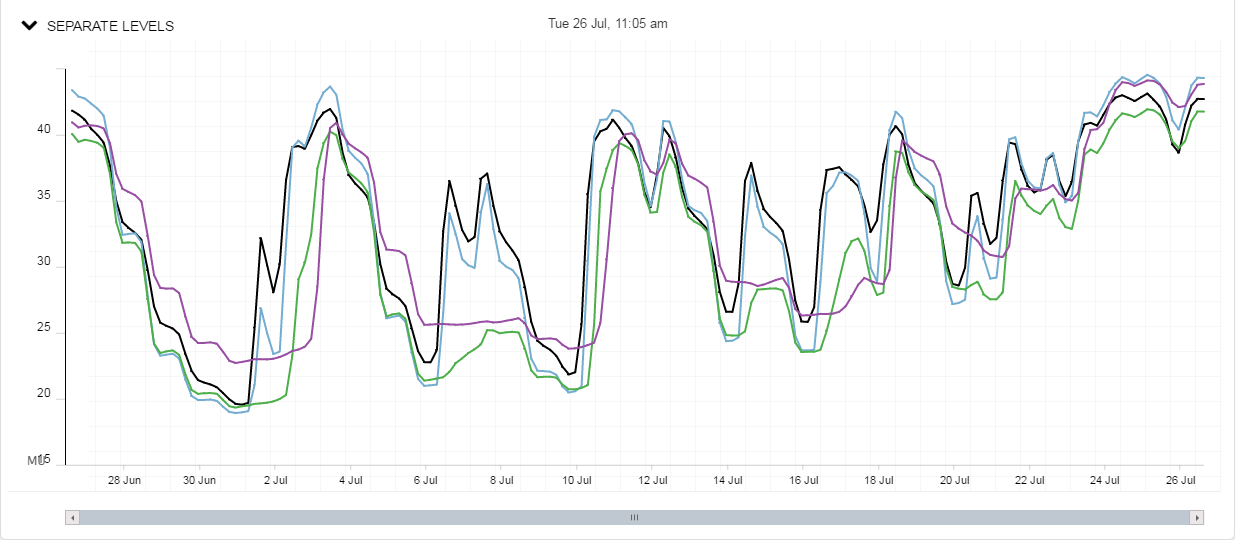
Then the values are displayed in relation to the actual moisture level of each sensor. Sensor data is now color coded for easy identification.
Root Zone Change View
Selecting ‘Root Zone Change’ provides another way to visualize changes in root zone moisture. The blue bars represent the daily total depletion from the root zone, and the green bars represent 24 hour total wetting events.
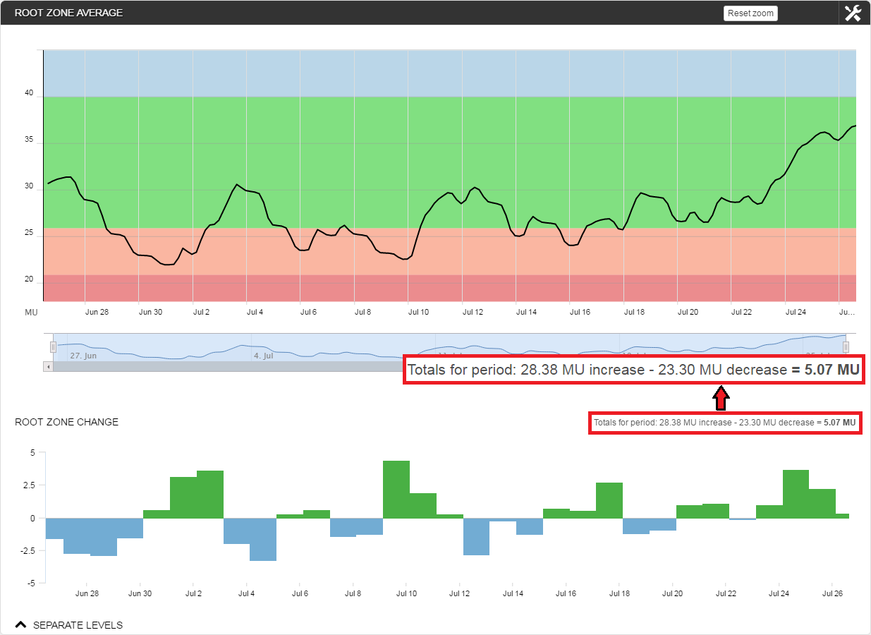
Since, in this case, the sensor is not calibrated, the changes are expressed in raw Moisture Units (MU). When dealing with sensors calibrated to a volumetric water content value (eg, mm), the units of measurement can be changed appropriately.
Regardless of the units employed, in the Summary Box we see that 28.38 MU were added to the root zone, while 23.30 MU were removed. Thus, there was a net loss of water (-5.07 MU) for the total 30 day time span.
Graphing Other Sites in the Portfolio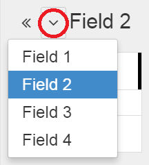
Clicking on the down button next to the site name provides a drop-down menu offering quick access to other sites within the portfolio. In this case we see there are three other fields in this Western Farms portfolio.
Daily ET Calculation
For customers with the Davis Vantage Pro2 Weather Station, it is also possible to include daily evapotranspiration (ET) calculations in the display.
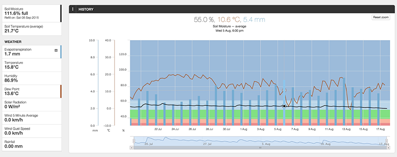
Observant Global calculates ET using the Penman-Monteith equation for daily time intervals. The implementation is based on the Food and Agriculture Organization (FAO) guidelines. The time intervals taken are midnight to midnight.
The sensors required are:
- Wind speed
- Solar radiation
- Temperature
- Humidity
The psychrometric constant is set at 0.0655 and the saturation vapor pressure is derived using a function based on the air temperature rather than being recorded with a sensor.
See the video Displaying Evapotranspiration (ET) Data with Crop Manager for further details.
Links
Articles
- Observant's Approach to the Display of Soil Moisture Data
- Overview of the Crop Manager and Analyze Applications
- Using Crop Manager
- Selecting Soil Moisture Monitoring Devices
- Setting Management Boundaries
- Limiting a chart's moisture range in Crop Manager
Videos
- Brief Overview of Monitor, Locate and Alert applications of the Observant Global™ Software Platform
- Overview of Observant Global™ Software Platform
- Displaying Evapotranspiration (ET) Data with Crop Manager
