The Analyse app allows you to graph data from multiple sensors together.
Creating the Graph
Sign In to Observant Global.
From the Locate Application
Choose Analyze from the drop-down menu.
Choose the site you wish to examine.
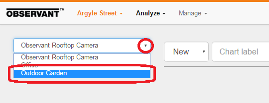
Click on the items you wish to compare.
Both data sets are printed, each with separate, color-coded line and Y-axis.
You can now print the chart and/or save it as a PNG or CVS file. If you wish, you can also label the new chart, saving it for updating later.
From the Monitor Application
Select a Monitor Panel to view its data.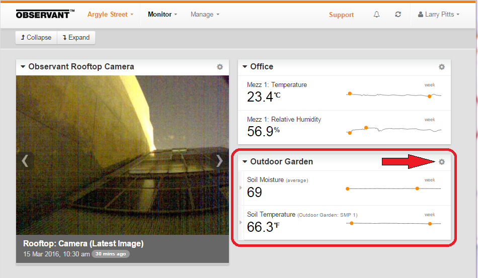
Click on the 'cog' icon to access 'Analyze' in the drop-down menu, then click on it.
Click on the items you wish to compare.
Click on the items you wish to display and, as above, both data sets will be displayed on the same graph.
Manipulating the Time Display
Choose One of Three Time Spans
Use the time scale selection bar to select “Week”, “Month” or “3 Months”.
Here we've chosen a week's worth of data.
View Conditions at a Specific Time
Hover your mouse point over a point on the graph. In the chart below we see the data for 3 pm on March 10.
Expand Chart to a Time Span of Interest
To zoom in on a time period of interest, drag a rectangle around your area of inerest in the graph.
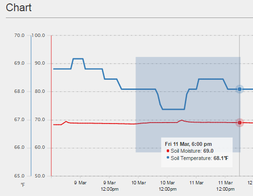
It will then zoom to the region selected, as seen below.
Return to the Original Time Span
Click the "Reset zoom" button to return to the original time span.
Exporting Data
Select one or more data series by clicking on them.
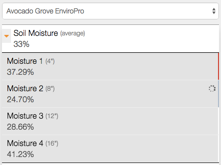
For each data set, specify the appropriate timeframe.

When your selections have been made, preview that data to be exported.
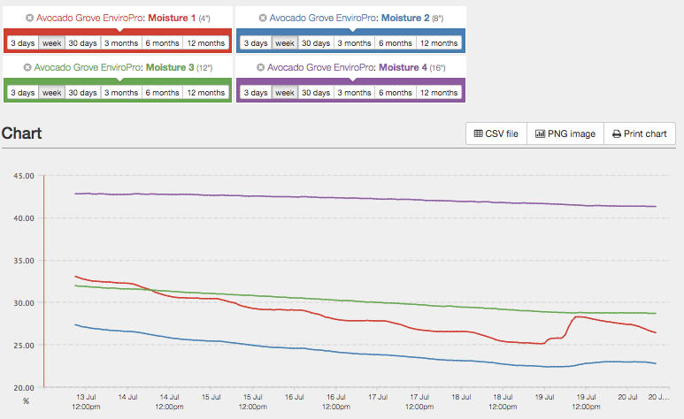
You may then export the data in any one of three different ways.

- As a CSV file, for use in any spreadsheet or reporting application capable of opening CSV files.
- As an image, in PNG format, for inclusion in reports.
- Directly to a printer.
Hint: If a given data set is being exported on a regular basis, save the desired view for reuse later. That way any future formats, time frames, and data sets will be directly comparable to the prior ones.
